
Hey Robert,
This is my “Case Study” page for this Phi Kappa Tau project. Below you will see my design decisions for making this a successful project.
But first... Here's your animated logo!

Project details
These were the details we hashed out before I began the project.
- Design and animate a looping badge/logo for Phi Kappa Tau
- Consideration taken to deliver a solution that can be used in a variety of places and scales (primarily Instagram, secondarily Twitter and Facebook, thirdly video intro/outro)
- Thick line, smooth animation style
- Focus on the Greek letters, but “Phi Kappa Tau” written out is also an option
- “Huntin’, Fishin’, And Lovin’ Everyday” is an optional slogan
- Outdoors theme with suggested content: log cabins/ horsemen in the Appalachians/ deer / banjo / letters on an old log cabin/ mountaineer picking a banjo
- Use Phi Kappa Tau brand colors
- Designed and animated to attract like minded, outdoors/adventure type men to Phi Kappa Tau for rush season and elevate the Phi Kappa Tau brand toward the goal of becoming the largest and best fraternity at ASU
Elements
There were several good element suggestions.
- letters on an old log cabin
- horsemen in the Appalachians
- deer
- banjo
- mountaineer picking a banjo
Since this is a short animated logo, I had to limit the elements to the most essential and ultimately decided on letters on a log cabin, deer, and fish to complement the slogan “Huntin’, Fishin’ and Lovin’ Everyday.”
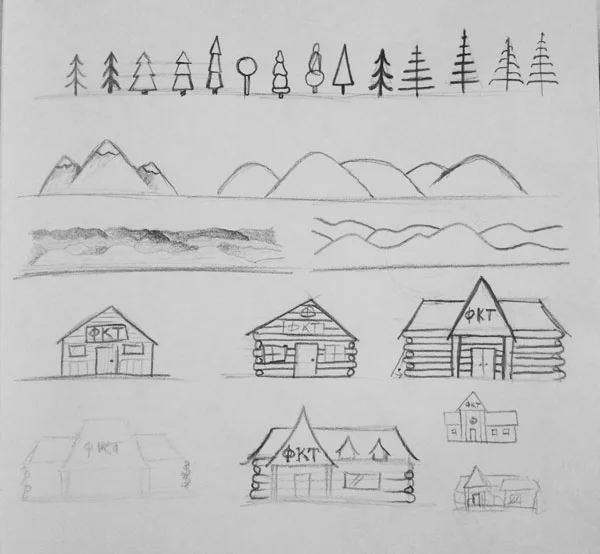
Sketches
I started off by turning on some Bon Iver and José Gonzáles to get in the right mountain mood. I got started on sketches of trees, mountains, and cabins. I explored a range of realistic to super stylized. The end result for each was a simplified version of a realistic style.
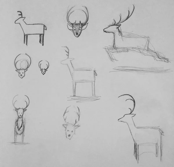
My second sketch page was for the deer. I explored head on angles and profile. Profile ended up making more sense because of the scene setup.
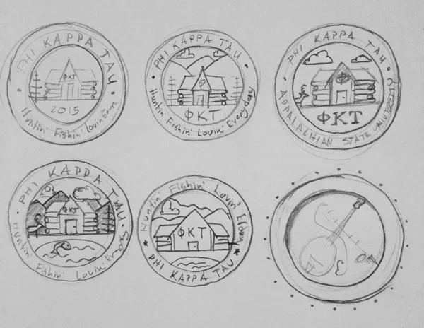
The next sketch was for taking a look at layout options. Since Phi Kappa Tau is new to ASU, including the letters and the full name was important. The cabin was the best place for the letters because of the given space as well as context. Greek letters are often posted on the front of frat houses. The full name worked best in the circle at the top. The slogan makes most since below the name because it is less important than the name.
The mountains, cabin, and pond serve as the grounding elements that give a sense of space. We’re in the mountains and we belong outside, huntin’ and fishin’.
Styleframes
Since this was a one scene piece, I approached the style frames by exploring several directions for main elements. In the end, the best options were the ones that worked together well and enhanced the feeling of “Huntin’, Fishin’ and Lovin’ Everyday.”
Trees: The tree on the left was close, but too flat. The tree on the right has strong lines that complimented the log cabin, but really just looks dead. The tree in the middle has a playful highlight that feels more friendly and adds a bit more dimension. This bit of dimension matches the Phi Kappa Tau brand (brotherhood and fraternity, but also outdoorsy and fun).

Deer: The deer is pretty straight forward. He’s simplified and steady. Antlers made for a strong design. The shadow in the deer ended up taking more away from the design. So the flat color, antlers, and walk cycle highlight his time in the spotlight.
Fish: The fish that was the strongest was the trout. This is a fish that you can find in the Appalachians, so it really made the most sense.

Clouds: The strongest cloud design matched the cabin design: strong structure and rounded ends.

Animation decisions
Panning
I explored panning from left to right, but the looping option for this would not have worked out as well as panning top to bottom. Panning top to bottom also gives a grandiose sense of the area we live in.
Deer
I first had the deer walking in from the side and stopping before he crossed the cabin. This was ok. But when he walks in front of the cabin, all the way across the scene, it’s much more dynamic. And this draws your eye toward the fish that’s about to jump out of the water.
Fish
The fish jumps out of the water and flaps around to give a realistic feel. He apexes in the center to give balance to the deer crossing the other way.
Text
The text comes in and goes out smoothly from the center. The easy going nature of hunting and fishing and the chill vibes I got from the Phi Kappa Tau brand lent for this sort of overall animation.
Deliverables
- .mp4 video file Before you post this to Instagram, please read this tip on making sure it doesn't post with a black frame when it loops :)
- looping animated .gif
- guideline for how to get the most out of your new animated logo
- Bonus: 1080p video (this can be used as an intro/outro to a video you produce/shoot.
Final thoughts
When we talked about this project, I got excited to dive into the right mindset to build an effective animated logo for such a cool fraternity. All of my design and animation decisions were based on representing the Phi Kappa Tau brand and it’s unique outlook at taking advantage of the wonderful outdoors the surrounds ASU.
It was a pleasure to work with you, Robert.