
Picnic Tree Productions
Logo redesign and animation
Max Anderson and his brother grew up in the Arizona desert. And the only tree around was in their backyard. They would have picnics under that tree and dream about the big things they were going to do with their lives. When you’re a kid, anything is possible. Picnic Tree Productions represents where Max comes from and larger than life dreams.
Along with being a story telling videographer, Max is a world traveling outdoorsman. He wants to attract clients that want to tell their story in a refreshingly honest way.
Goals
The goals for the logo are two fold. The first is to represent Max's personal meaning and characteristics. The second is focused on attracting great clients through a highly attractive visual appeal. The visual direction of the logo embodies a rough and rugged feel with the structure and balance of a brand that know’s where it’s going.
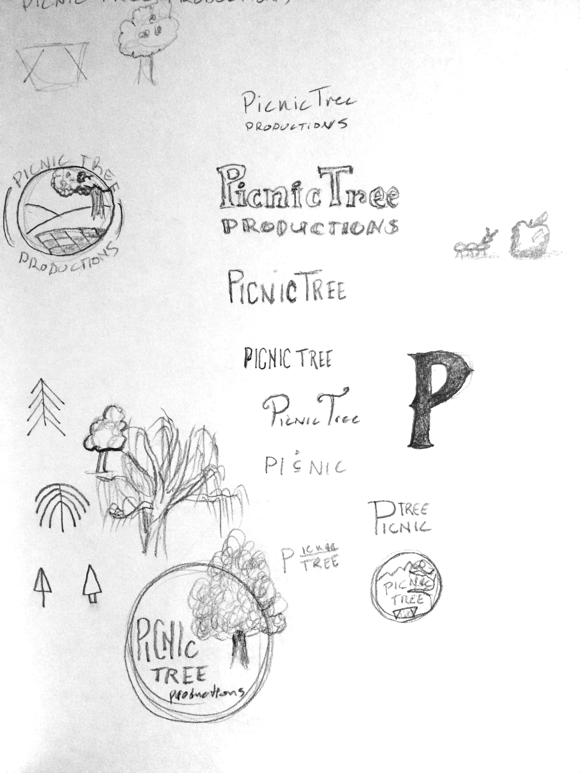
Sketches
The first part of my process is to sketch out a lot of possible solutions. Some may be downright bad, but that's not the point. The sketch phase is for brain dumping visual ideas.
Logo
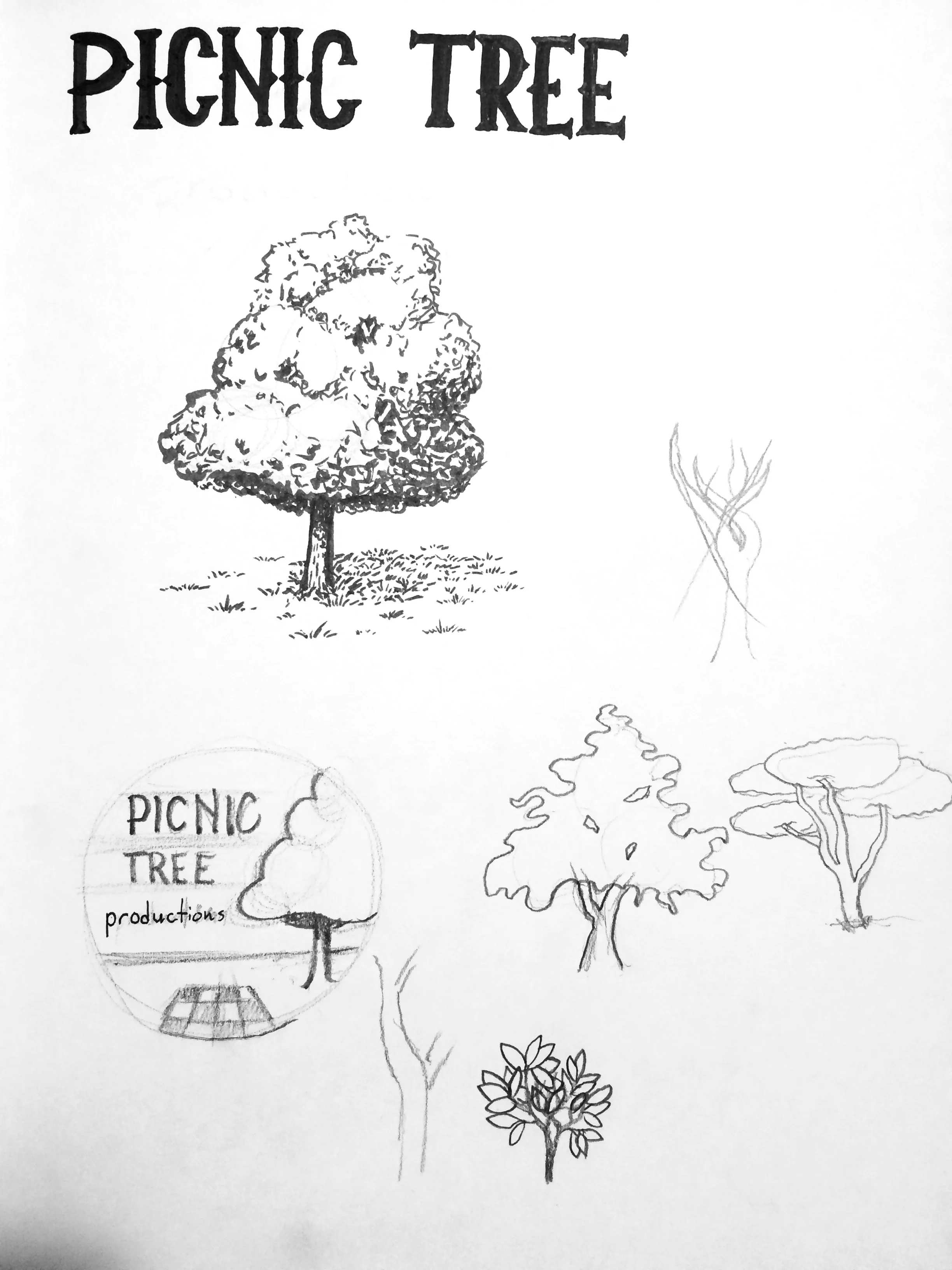
I had a bit of back and forth with the sketching and designing phase for this project. I sketched a bunch, brought the sketches into Illustrator, worked on vectors, went back to sketching, updated vectors, threw them into Photoshop, added textures, and around and around. This bouncing back and forth a bunch resulted in a logo solution that hit all the goals.
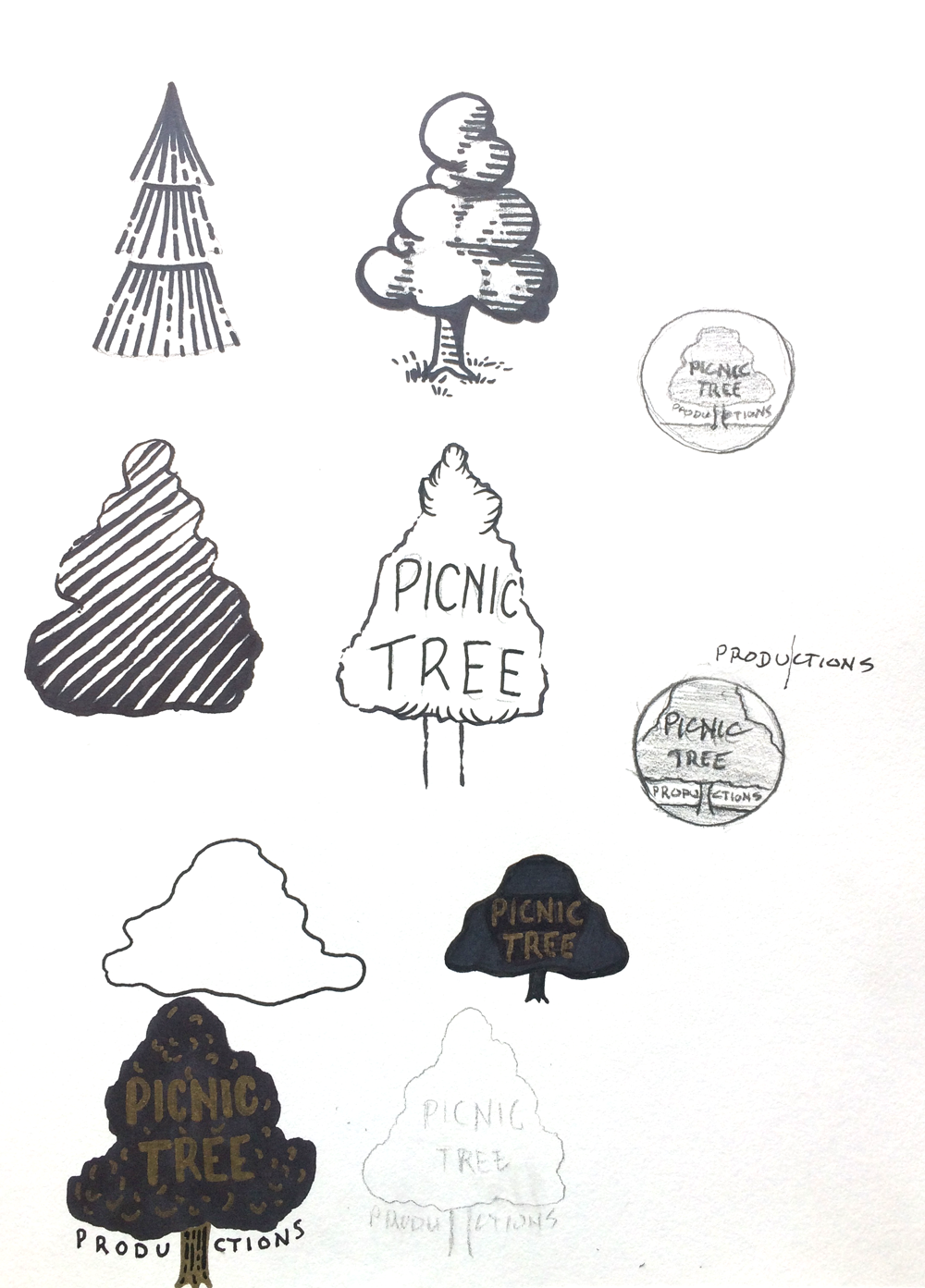
Initial direction
The first full direction this logo went was close. It was getting there. But there were some problems. The rendering of the tree didn't match the visual direction of everything else. And the picnic blanket felt a bit slapped on. I ended up scrapping the layout of this design, but keeping the circle outline and style of the lettering.
Final direction
Even in the final direction, there were still some design elements that had to be changed. "PRODUCTIONS" felt awkward being split by the tree and the top part of the tree shot up like a Marge Simpson hairdo. The grass was also looking a bit like clip art grass and didn't fit the brand feel of adventure and great story telling.
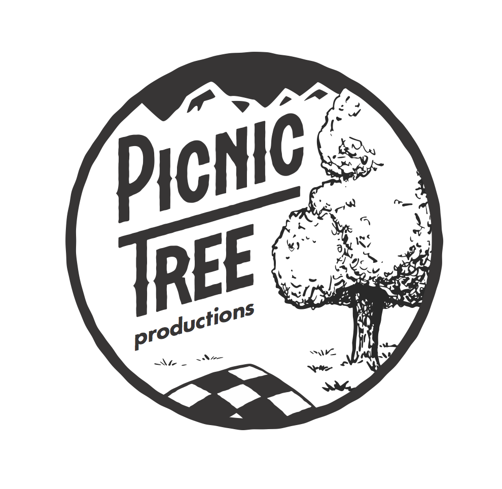
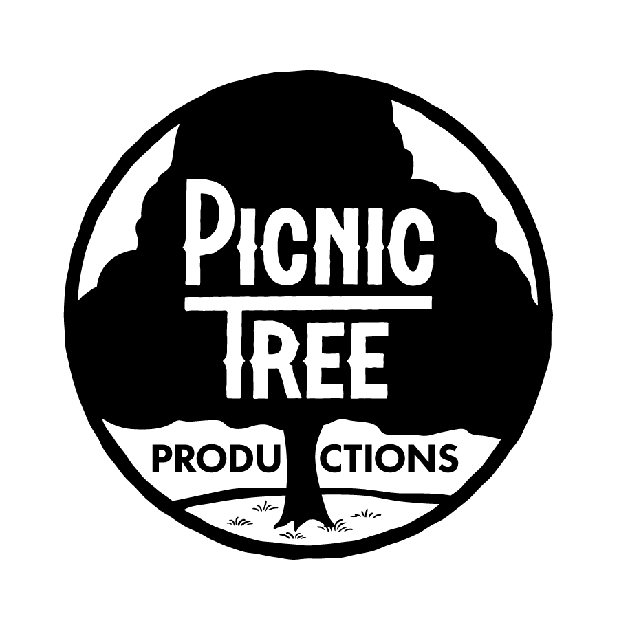
FINAL LOGO
With some tweaks and added textures, this logo is now firing on all cylinders.
Clean Version
The purpose of the clean version is incase the logo needs to be blown up very large (the textures are pixel based and won't scale up larger very well). The texture version can be used in 95% of use cases. I just wanted to add this for the fringe use case.
Animation
The purpose and intent of the animation is to be entertaining, add to the feel of the brand, help Picnic Tree Productions stand out as a premium company, as well as serve as a way for his audience to remember the Picnic Tree Productions name and channel.
Inverse
I also made an animation with the inverse colors so it would work over video content that was darker.
Deliverables
Illustrator (vector) file of the logo
Photoshop file with textured version
PNG and JPG versions of the logo
animated gif of in and out animation that loops
animated gif of in-only that doesn't loop (good for using on website header)
high res video with alpha of looping and non-looping versions
After Effects file of the animation (we can hop on a Skype call soon and go over different things you can do with the After Effects file)